

Subscriptions in MicroStrategy Library Mobile (iOS)
02/2021 - 09/2021
MicroStrategy Subscriptions was a legacy file delivery product that allowed analysts to subscribe to documents. Though being powerful and versatile, it struggled to live up to modern functionality and user experience standards. Therefore, in early 2019, MicroStrategy planned to bring Subscriptions to modern client applications with an all-new design and user experience.
In spring 2019, I partnered with another UX designer and conducted the initial user research that provided valuable research insight which influenced the final project scope. In 2020, I worked with PM, engineering lead, and visual designers to plan, design, and develop the all-new Subscriptions experience in MicroStrategy Library on iOS.
The problem - not a typical redesign project
Users of the legacy MicroStrategy Subscriptions used to subscribe to documents and reports and have them delivered to their email inbox, internal FTP server, or printing terminals. However, at the time of its development over two decades ago, a user-friendly experience was not considered as one of the main criteria. As a result, the product looks and feels outdated with its over-complicated flows, 90s-style user interface, and of course, it was not designed for any mobile devices.
Therefore, the leadership plan to gradually phase out the legacy MicroStrategy suite and bring Subscriptions to the modern MicroStrategy client applications with an all-new design and user experience. However, this is not a typical redesign project where the redesign still happens within the same hosting client or platform. For this project, a new experience of Subscriptions needs to be designed in brand new clients, which could also mean a dramatic shift from its original desktop-centered experience to a potential cross-platform experience.
A closer look at existing issues
Since my mission is to design a next-gen Subscriptions experience in modern MicroStrategy clients, a closer examination at existing issues is needed to better understand its issues and areas of improvements. I started by testing the product's main workflows and collecting issues/strange pieces I observed. Here are the primary ones:
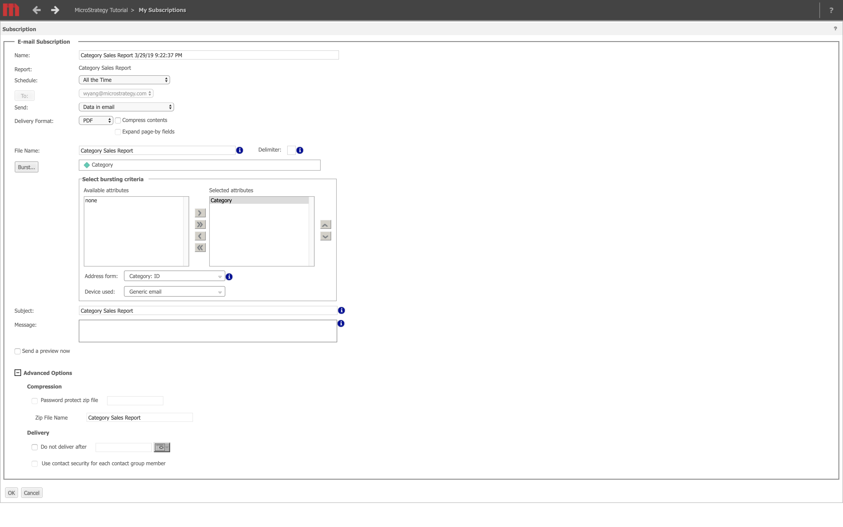
- 1The root of "outdated and complex" experience - some legacy features don't apply to present-day business users or analysts anymore. To be more specific:1Features like FTP being a delivery method doesn't apply to present-day users anymore, not to mention it is slow and insecure compared to modern file transfer methods.2While the Subscriptions was targeted at business users and analysts, there were advanced features in the legacy UI like burst and contact security which are administrator-facing and they can only bring confusion and complexity to the experience of business users and analysts.
 In the legacy web portal UI, there is an advanced yet outdated feature - burst, which enables users to subscribe to only certain data attributes of a document instead of the whole document. However, business users who are generally not experts in MicroStrategy won't even know how to use it. In fact, it was also retired as a legacy feature years ago.
 - 2The entry points of create-new-subscriptions in the legacy Subscriptions web portal were forked by delivery method instead of centralized into one place, meaning user would have to make a decision among eight types of subscription before actually creating one. This can demand unnecessary mental and physical effort from users. Also, it makes switching delivery method during creation flow quite awkward, or should I say, almost impossible?
 In the legacy web portal UI, users had to make a decision on the type of delivery method (there were 8 types) before creating a new subscription. If the user wanted to switch to another delivery method during the create-new-subscription flow, they would have to exit out and select a new delivery method to start all over again.
 - 3Using a custom schedule to deliver a recurring subscription was not supported. Users had to use schedules defined by administrators, even when they subscribe only to themselves.
 User can only pick from administrator-defined schedules that might be irrelevant and confusing to them and they can't create their own schedule in the legacy Subscriptions.
 - 4The Subscriptions tab grouped subscriptions by delivery method, resulting in several lists with different columns headers that are visually unaligned. This design makes the visual hierarchy of the page rather messy and hard for users to scan and locate information.
 In the legacy Subscriptions web portal, all types of subscriptions are placed within the same page with different sets of columns headers. For example, the list in the Shared Links group has seven columns while lists in other groups all have eight columns, not to mention their columns are always unaligned.
User Research
After examining the product, at this point, I had a basic understanding about how it works and where it is lacking. Then I would like to find out what actual users thought about it, so I partnered with another UX designer to conduct initial user research. We first launched an online survey to the internal and external users to ask about their general thought, pain points, and suggestion with the legacy Subscriptions, then scheduled interviews with select users who responded.
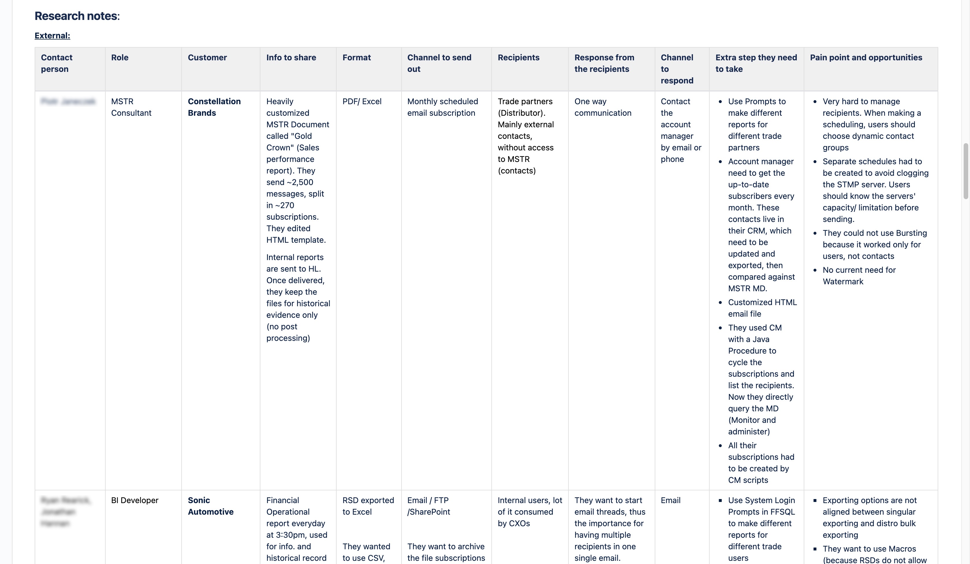
Based on the survey and interview results, we summarized the pain points users were encountering and opportunities we could leverage to address these pain points in the next-gen DS.
Users' primary pain points
The burst feature was hard to learn and use even for administrators who are familiar with MicroStrategy. Many users ended up not using it at all.
There was no mobile experience which makes it inconvenient to view or manage subscriptions when users are out of office and have limited access to desktop.
Understand target audience's context
Goal: Business users and analysts usually subscribe to documents they are interested in or required to read (in which case administrators might do this for them). When it comes to managing subscriptions, their primary goal is to unsubscribe certain subscriptions, followed by modifying the schedule of an existing subscription, neither of which were available in the legacy Subscriptions.
Time: The moment when a user subscribes to a document or an administrator subscribes someone to a document is usually random, which means easy access to Subscriptions via a mobile device will be a huge plus.
Platform: Business user and analysts can only use the legacy Subscriptions on a desktop/laptop because that was the only platform to do so. However, in the new Subscriptions experience, they should also be able to do so on a mobile device, as reflected by the research results.
Delivery method: According to survey and interview results, all users use Email as their primary delivery method.
Delivery format: Around 70% of users subscribe to documents in PDF or HTML. 54% of users subscribe to documents in Excel.
Users' asks (opportunities)
Most users want to be able to create, view, and manage subscriptions they own and the ones delivered to them on their mobile devices.
Being able to customize delivery schedules rather than having to use pre-defined schedules is frequently mentioned.
Around 69% of users use HTML to format the email body in email subscription, but the legacy Subscriptions only exports the subscribed document in pure HTML without any formatting options. Therefore, some users request to be able to use an HTML editor to format the email body in the new Subscriptions.
Integration with modern file sharing and messaging applications like Dropbox and Slack which can enable users to receive subscribed documents directly in these applications is also requested.
Intermission
Yes. There was a pause on this project since we finished the user research in May 2019 because of the company's shift of priority. Fortunately, the research results did serve as a trustworthy reference when the project was resumed in mid-2020 and the final project scope was heavily influenced by them.
Updated scope
In mid 2020, this project was resumed with the vision to bring the enhanced and expanded Subscriptions experience to all modern MicroStrategy client applications on desktop, web, and mobile devices. The leadership planned to resume the design on desktop experience first. As the scope expanded, so did the team. This part was handled by other UX designers.
According to our research results, the new Subscriptions should offer a mobile experience. Therefore, in spring 2021, the design on mobile experience of the new DS was also resumed with the scope to bring new Subscriptions to MicroStrategy Library Mobile. I was assigned to work on the iOS and iPadOS version of mobile experience.
Here is a quick summary of the updated scope for the mobile experience on phase one:
As a business user/analyst, they should be able to create, view, and manage subscriptions they own and ones that are delivered to them by others on MicroStrategy Library Mobile (iOS and iPadOS).
As a business user/analyst, they should be able to subscribe to a document by email, as this is their primary delivery method (suggested by research results).
As a business user/analyst, they should be able to have the document delivered to their inbox in PDF or Excel format.
Design setup
As a designer myself, I usually like to start my interface design by listing the requirements and constraints for my project. These requirements and constraints can help me set the direction for my design.
Requirements and constraints
Since the new Subscriptions experience will be built in MicroStrategy Library Mobile, all UI components and interaction patterns should follow existing guidelines and stay consistent between iOS and iPadOS.
In terms of accessibility, the new Subscriptions experience will support VoiceOver.
Entry points
Since the new Subscriptions will be a new feature built inside the Library Mobile, it is a good practice to make its entry points stay consistent along with other existing features.
Create a new subscription
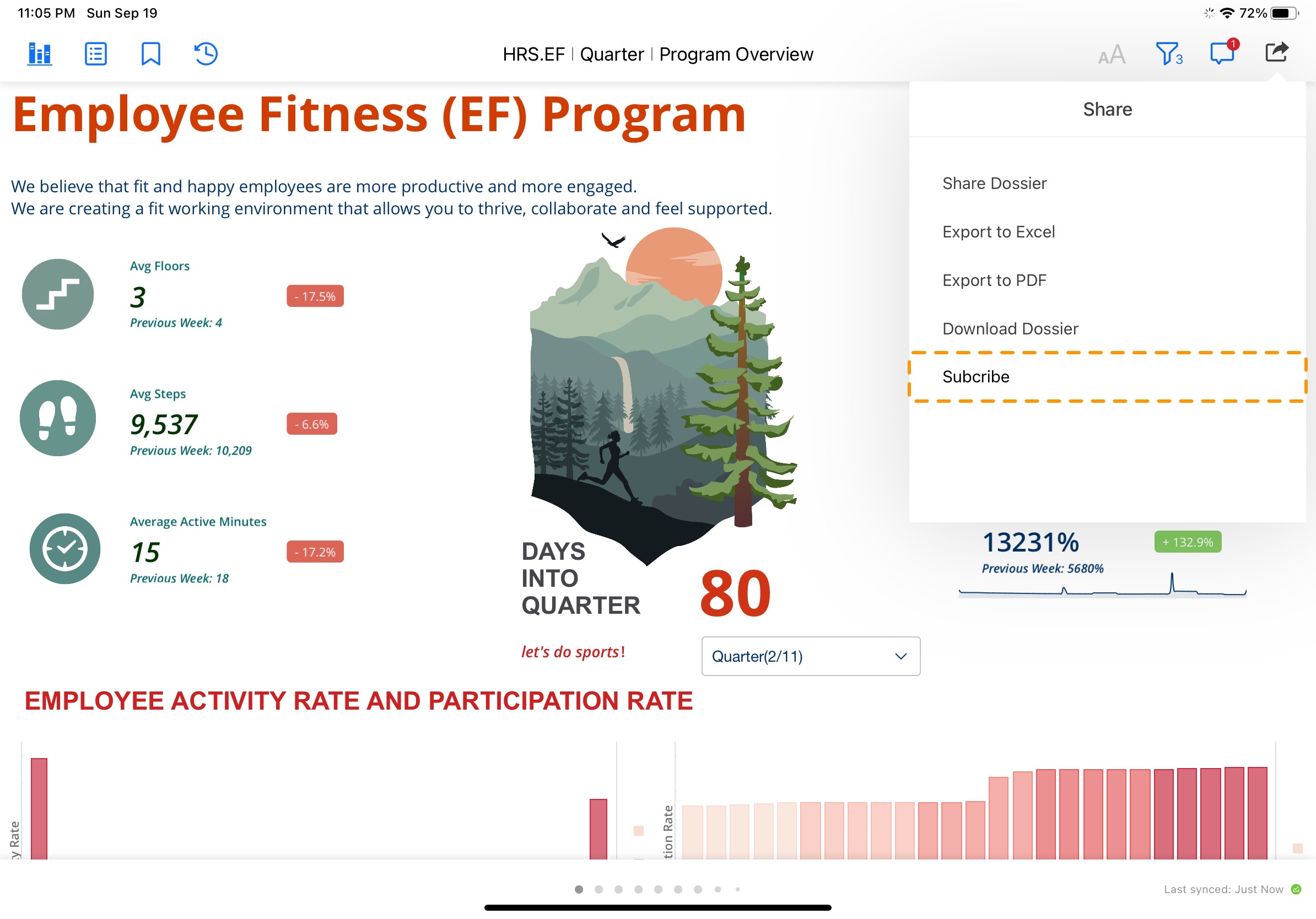
The entry point of creating a new subscription has always been within the document which the user will subscribe to. Considering the core of subscribing to a document is sharing the document with someone on a regular basis, it still makes sense to have the Share panel within a document be the entry point of creating a new subscription.

Manage subscriptions
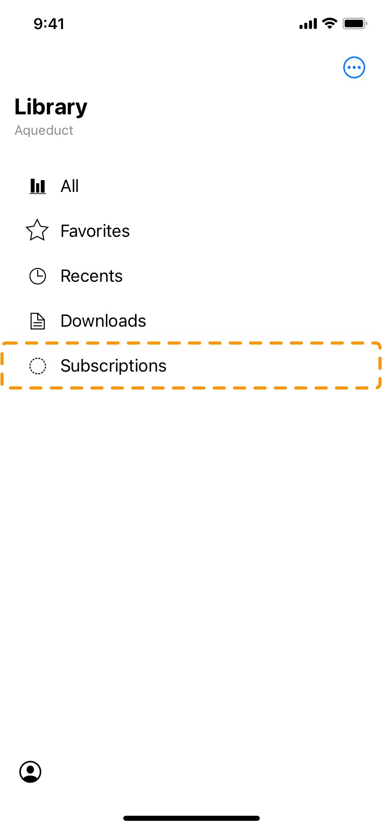
Like a dossier, a subscription will also be an object in Library Mobile that user can modify or remove. Therefore, I decided to create a standalone "Subscriptions" tab for all subscriptions, and place it next to other existing tabs for different types of user-manageable objects like Favorites and Downloads. Depending on the device user is using, the Subscriptions tab will be placed on the homepage on iOS or the primary sidebar on iPadOS.
Design
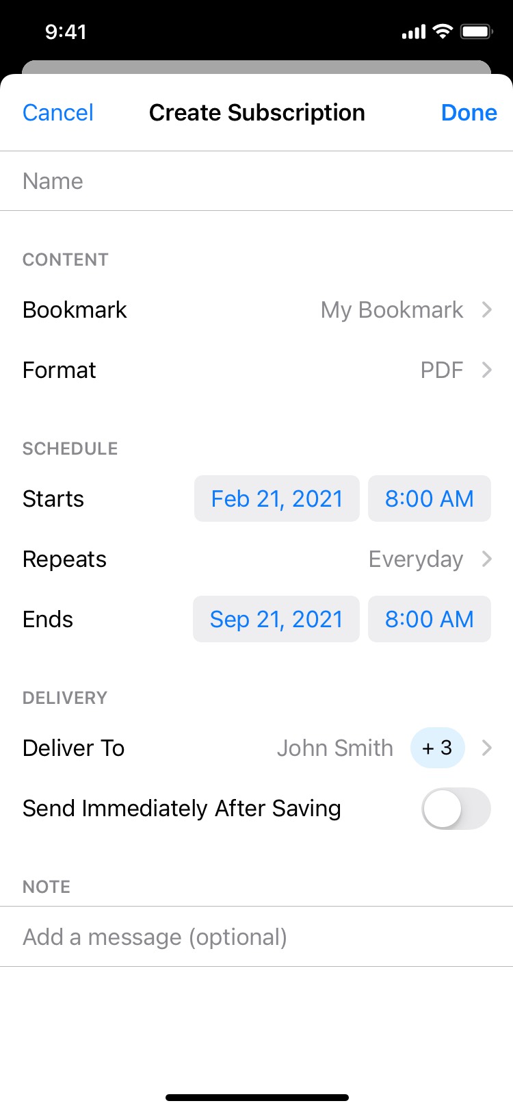
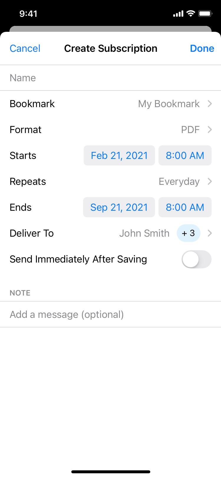
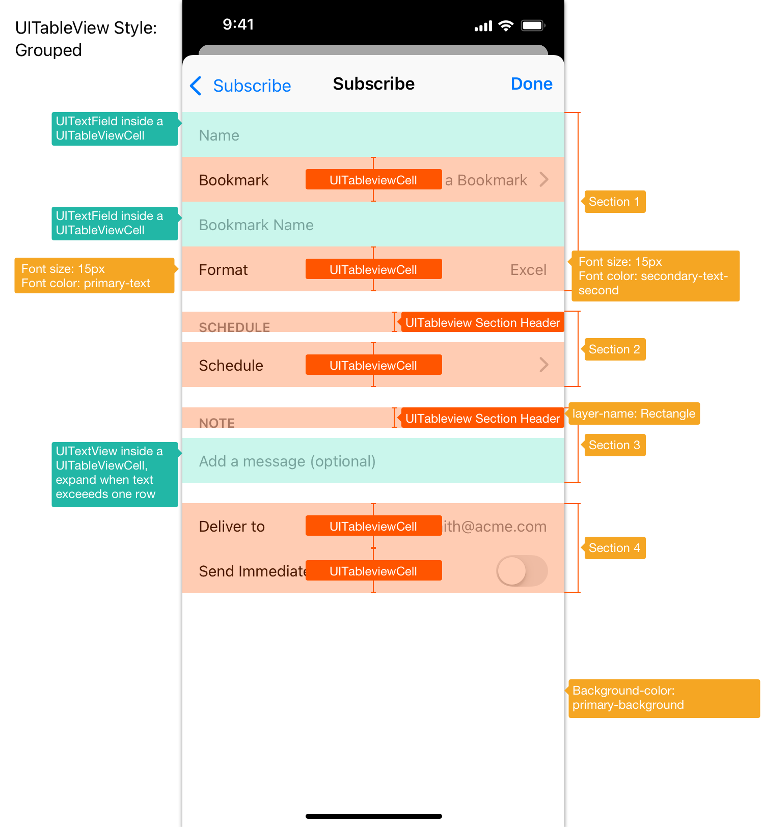
Create Subscription page
When a user wants to subscribe to a dossier, they enter that dossier, open the Share panel within the dossier, then they would select "Subscribe" and enter the Create Subscription page, which becomes the final step of create-new-subscription flow.
One of the major problems with the legacy create-new-subscription page was its overloaded technical terms and cramped UI controls. Being stuck with them at the final step of create-new-subscription flow was "annoying and confusing" according to user research.
Therefore, I tried to make the information and UI controls on this page easy to scan and navigate so that regardless of a user's familiarity with the UI, they can complete the fields easily. What type of UI structure makes the page easy to scan? A table view format is a great choice, and it is also a common pattern used in other MicroStrategy products.
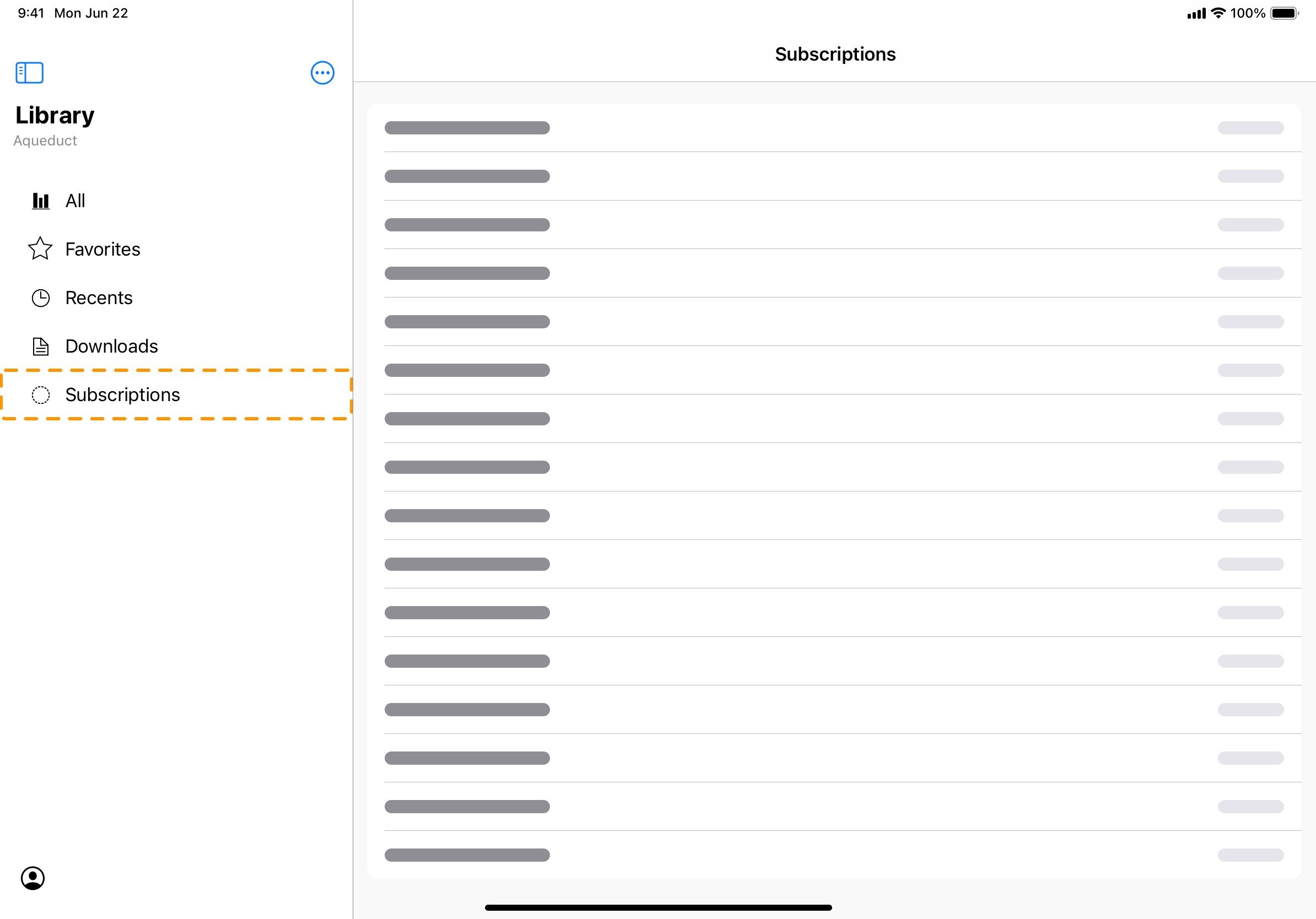
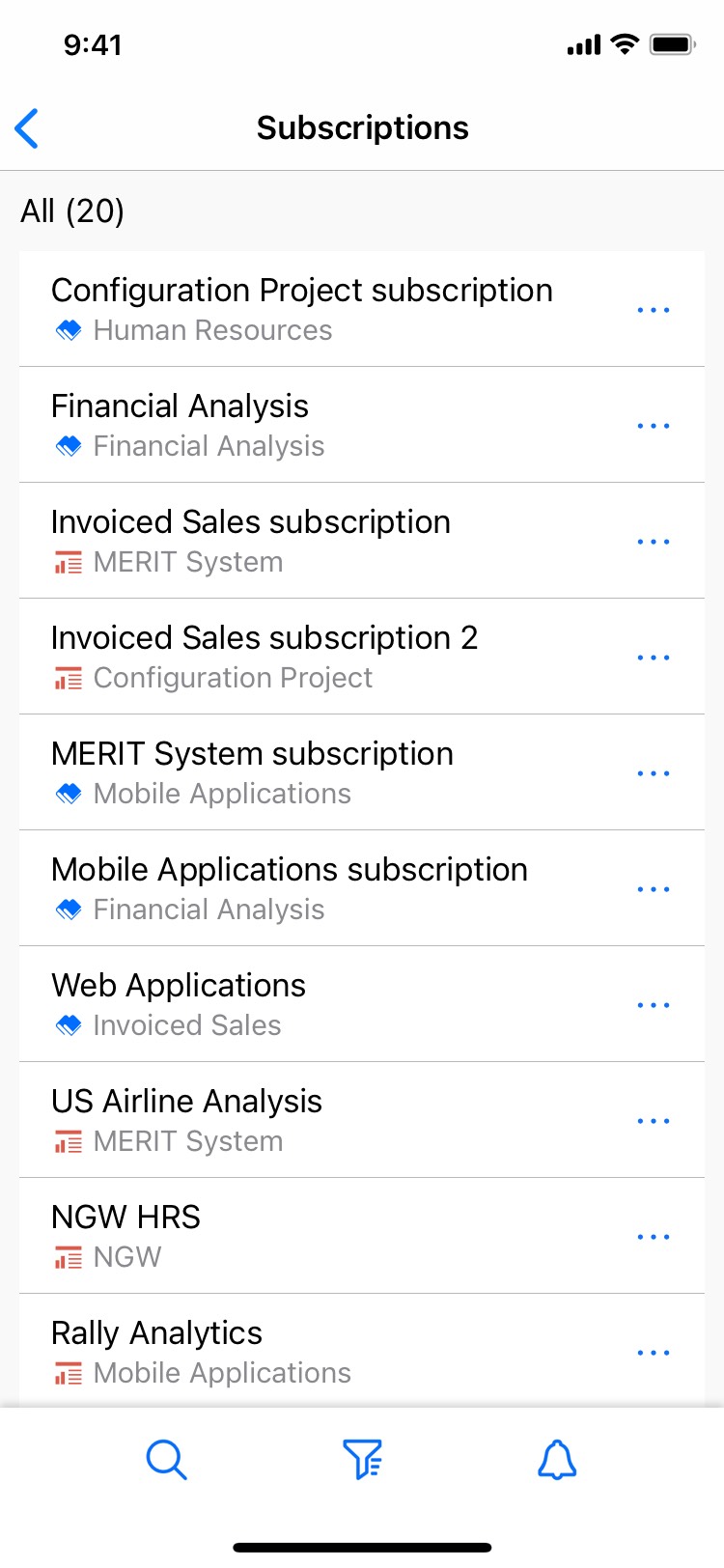
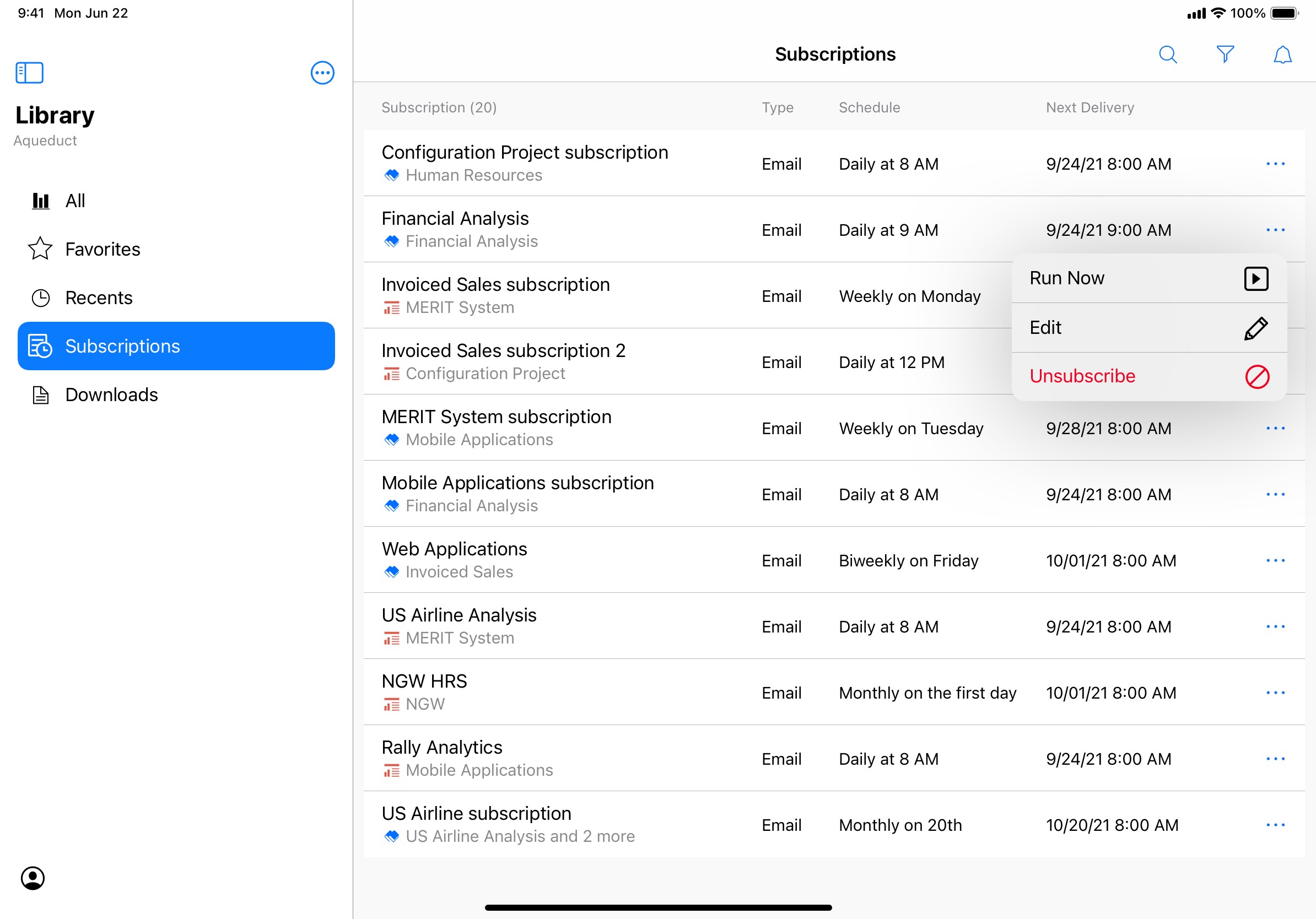
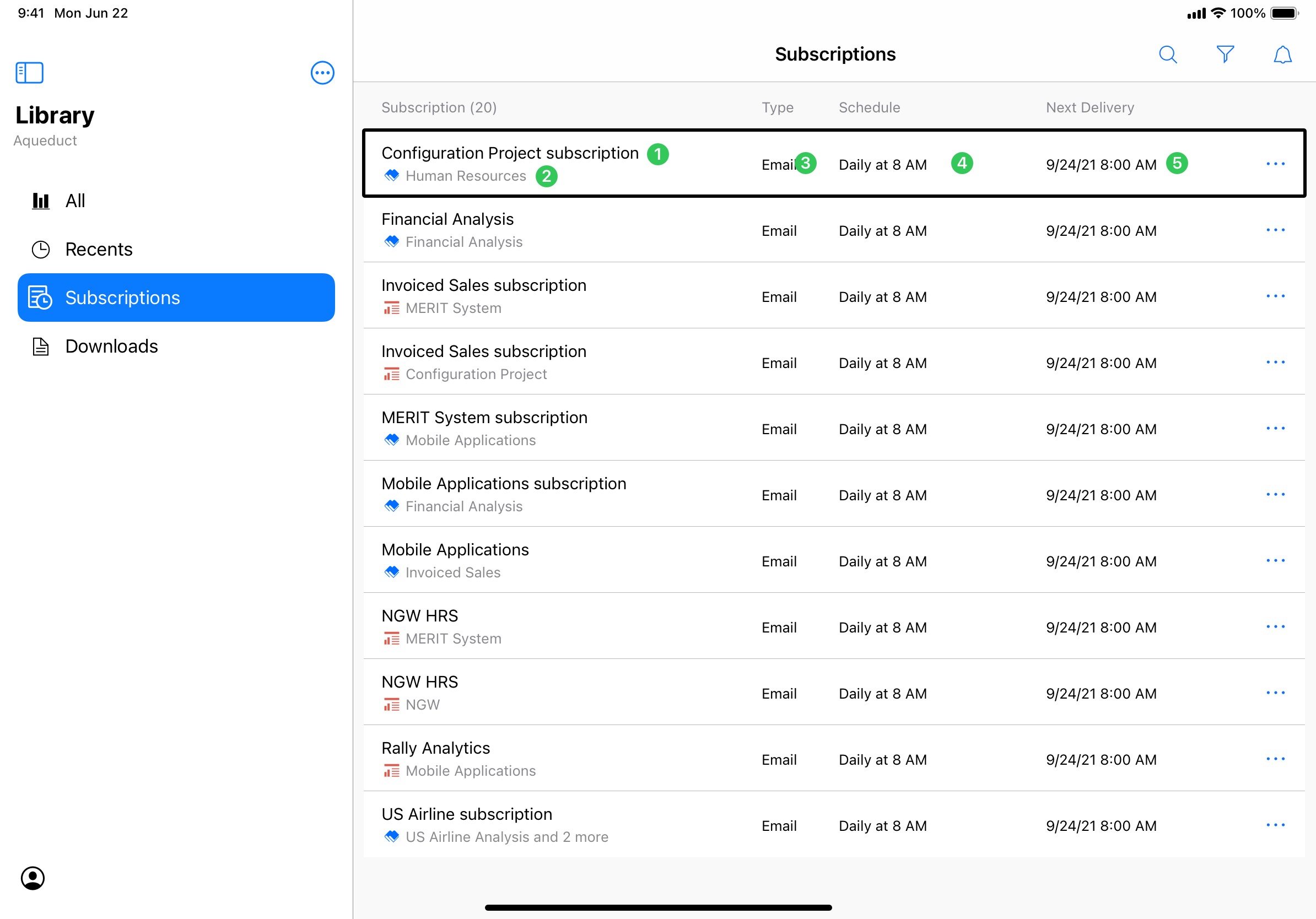
Subscriptions - a centralized folder for all subscriptions
Once users have created their own subscriptions, where do they go to manage them? A centralized folder for them to manage all subscriptions. The legacy Subscriptions web portal had exactly that, but the biggest issue with the legacy Subscriptions list was that all types of subscriptions are mixed together yet each type has its own unique column structure, creating a list that is inefficient to read and unpleasant to look at.
To solve this issue, instead of grouping lists into sub-lists by delivery method, I used one single list structure to accommodate all types of subscriptions with metrics that are commonly shared between different types of subscriptions. This way, all metrics are aligned for easier scanning for information and the whole list view looks much cleaner. On iPadOS, other metrics like Type, Schedule, Next Delivery are displayed as additional columns to make better use of larger display of iPad.
To further assist with managing subscriptions, I also provided quick actions to each subscription with a menu:
Run now: executing a subscription anytime when immediate delivery output (e.g. PDF, Excel) is needed.
Edit: modifying settings of an existing subscription.
Unsubscribe: one of the most requested features from real users, being able to unsubscribe to a subscription created by administrators or someone else.
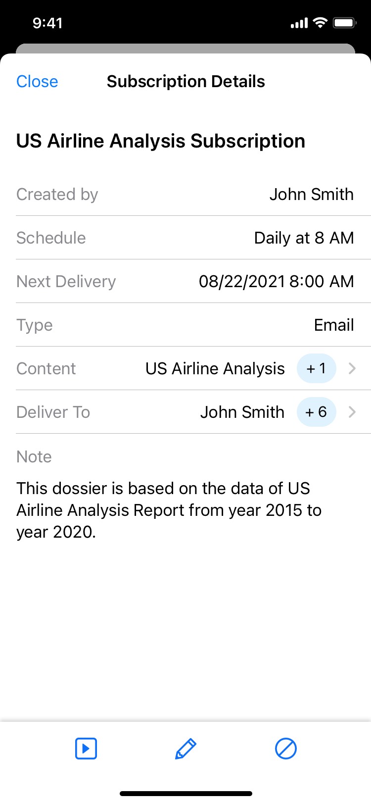
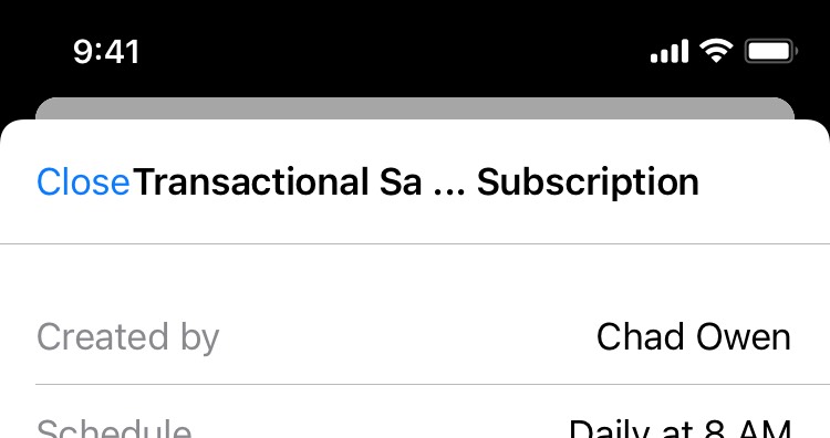
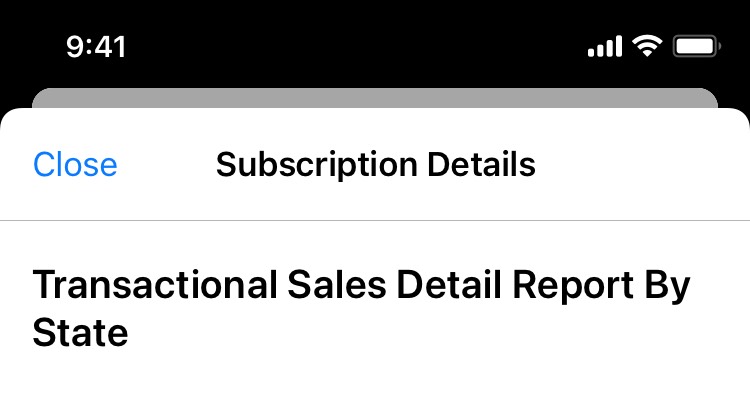
Subscription Details page
To learn all details about a subscription, users can enter the Subscription Details page by tapping a subscription cell in the Subscriptions list view. Since most information on this page is meant for consumption, I made sure the information on this page is easy to scan so that regardless of a user's familiarity with this page, they can locate a specific piece of information easily. Yup, once again I used a table view to remain a nice consistency among other pages.
Make it accessible with VoiceOver
Starting 2021, MicroStrategy Library Mobile will support screen reader on iOS and Android to provide users with vision impairment or temporary difficulties reading a more accessible experience. As part of 2021 release, the new Subscriptions experience in Library Mobile iOS will also support VoiceOver. My mission at this stage is to provide the appropriate labeling, grouping, and focus order to all UI elements in the Subscriptions experience.
Efficient grouping of accessibility elements
Group of accessibility elements matters. A logical and reasonable grouping of accessibility elements can make navigation using VoiceOver much more efficient and the information hierarchy easier to understand. An example to demonstrate this is the grouping rule I defined in the Subscriptions section on a document's information panel.

In this example, each subscription cell contains multiple metrics that could be read by VoiceOver separately. However, doing so will slow down the navigation and make it hard for users to understand the interface hierarchy. Instead, I grouped relevant metrics of a subscription cell into one large entity that will be read by VoiceOver as a whole, except for the ellipsis icon, which is used to reveal action menu so it deserves to be treated as a standalone entity and has its own accessibility label.
Logical order of VoiceOver focus
A logical and reasonable order of accessibility elements can also help users locate important information faster and speed up the navigation. When assigning order to a UI element in which it will be read by VoiceOver, I made sure elements of more importance are read before less important ones so that users can grab key information faster. An example to demonstrate this is the order of accessibility elements I defined on the Subscriptions page.
In this example, though placed below subscription title, the source document name will actually be read right after the subscription title and before other metrics. This is because according to the information hierarchy and user research, the source document is the second most important metric the users would like to know when viewing and managing subscriptions.
Usability testing
General feedback
After the engineering build became available, several rounds of internal and external testing were conducted for the new Subscriptions experience. The general feedback was mostly positive. Testers found that the concept of subscribing to documents they like on a custom schedule intuitive and easy to understand. Most testers were able to create, view and manage subscriptions with the new experience fairly easily.


Areas of improvement
There are several defects/areas of improvement found during the usability testing. Two major ones are listed below:
A hard choice to make
It was surprising that, according to usability testing, the number of users who like the Expandable/collapsable cell was actually equal to the number of users who like to view all content on a new child page. This becomes a hard choice to make. Eventually, I went with using a child page to display all documents and recipients. There are two reasons behind this:
Design handoff
After the usability testing and iteration on design, I set up meetings with the Library Mobile engineering team to go over approved user flows and the new UX/UI design. Then I created design specification for developers so that they can start implementing the design.
What I learned
A legacy product might have bits and pieces that don't apply to modern users anymore and fail to deliver a great experience. When reimagining a legacy product on a new platform/OS, it is crucial to speak with users and understand what their use cases are and how they react to the product. By interviewing real users, I was able to identify users' primary pain points and provide solutions that solve their problems using modern design languages.
Another learning highlight is building a great VoiceOver experience is not just about making it "usable" by adding accessibility labels. It requires thoughtful grouping logic and focus order to make the VoiceOver experience just as simple and efficient as the “regular” user experience is.


