

MCP Event Scheduler Redesign
MicroStrategy Cloud Platform (MCP) is a web-based application that allows enterprises to deploy, monitor, and manage cloud environments. In this seven-month-long project, I worked with PM, engineering lead, and visual designers to redesign the Event Scheduler feature that enables cloud administrators of enterprises to schedule, view, and manage administrative events for their cloud environments at MCP.
The problem
The MCP Event Scheduler had always been an important feature used by MCP users. With the Event Scheduler, Cloud administrators can schedule administrative events like starting, stopping, and restarting their MCP environments to save operation cost and reduce manual work.
However, it needed thorough redesign - multiple functionality limitations and usability issues had been found by customers and internal employees while using the legacy Event Scheduler prior to this redesign initiative. Therefore, in Jun 2019, I was tasked to work with the MCP Scheduler team to redesign the Event Scheduler feature and release it in Q1 2020.
A closer look at existing issues
Since my mission is to redesign the Event Scheduler, a closer examination of existing issues is needed. I started by testing the product's main workflows and collecting issues/strange pieces I observed. Here are the primary ones:
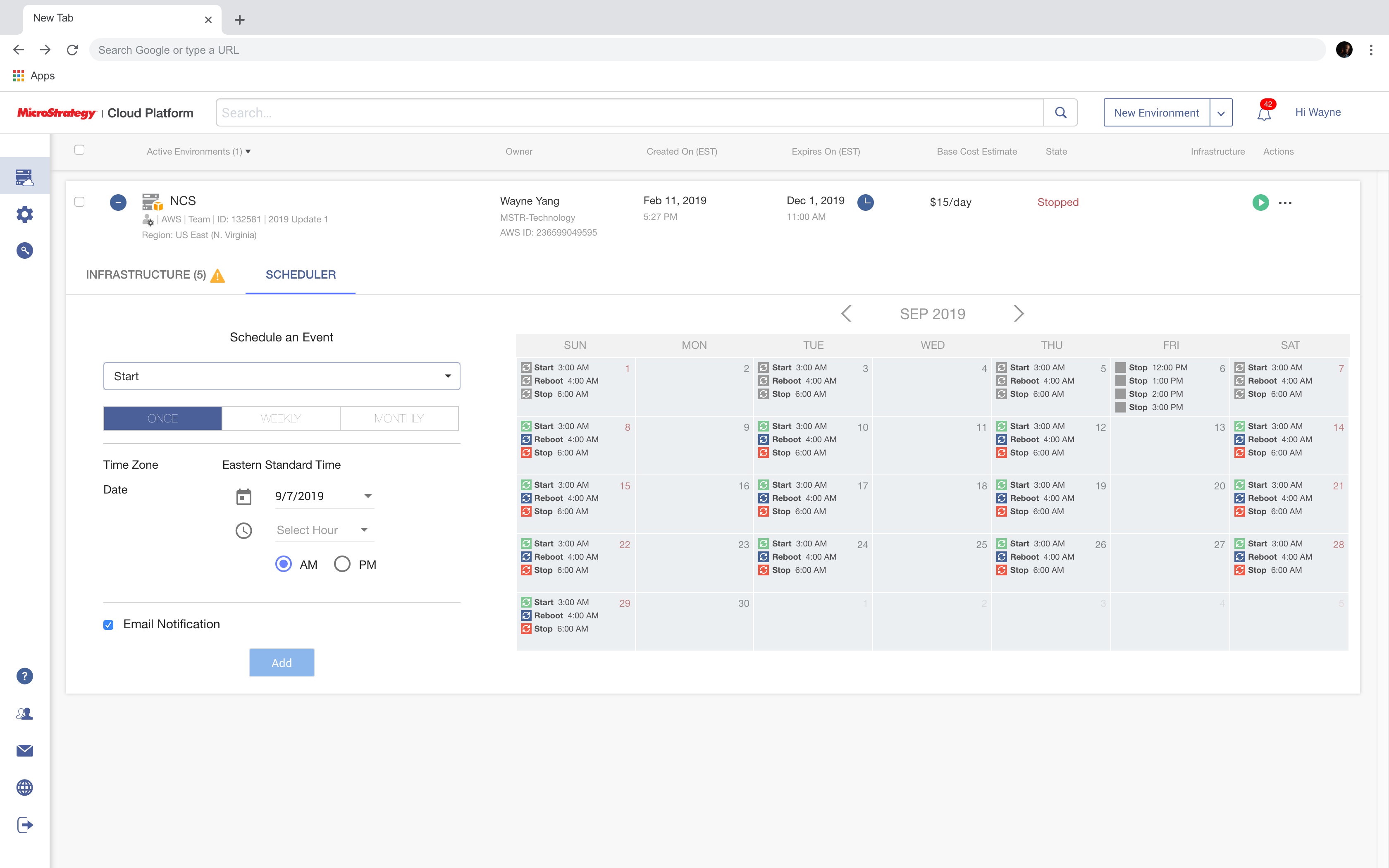
- 1It was hard to view or manage existing events in the legacy calendar. To be more specific:1For an existing event, user could not view its detailed information like frequency of a recurring event.2There was no naming logic for events, meaning all events that have the same "start" action would look the same from the calendar, though their frequency or start time might be totally different.3For some reason, user was not able to schedule more than four events on the same day (yep, it was real).
 In the legacy event scheduler, the only way to view information about an existing event was to look at the calendar. However, each calendar cell was not clickable, thus user couldn't find any detailed information about an existing event. What's worse was the lack of naming logic, as shown above, all highlighted events look confusingly similar even if they had different start time or frequency.
 - 2There was no ending logic in the legacy Event Scheduler, which means every event was an "eternal" event (unless it is deleted by the user or the earth explodes some day).
 In the legacy Event Scheduler, user was not able to specify an end date for the event.
 - 3Some labels on the UI used lower-than-normal font-weight, resulting in very thin characters and poor legibility
 The tab bar to switch between frequency types used really thin font because of a font weight of 100, which is too low to be legible.
 - 4The keyboard browsing support of the legacy Event Scheduler was not great. Several custom-built UI components like the calendar did not respond to keyboard navigation at all nor have any state-specific appearances.
User research
After examining the product, at this point, I had a basic understanding about how it works and where it is lacking. I wanted to find out what actual users thought about it, so I interviewed 5 internal MCP users to ask about their general thought and pain points with the legacy Event Scheduler.
Users' primary pain points
There was no naming or ending logic for a recurring event, this made event management labor-consuming and even more cost-ineffective.
The calendar widget in the legacy Event Scheduler was extremely limiting in terms of user experience and functionality.
Understand target audience's context
Goal: Cloud administrators usually schedule an event to save operation cost of cloud infrastructure and optimize the performance of cloud environments.
Time: Cloud administrators tend to use the Event Scheduler when there is a request to schedule start/stop/restart events for a cloud environment during work. Such request is usually informed in advance.
Location: Cloud administrators work on desktop by the desk most of the time.
Emotion: Mostly calm (because a request to schedule an event usually comes in advance so there will be enough time for this task)
User stories
Based on what I learned from the examination at existing issues and functional requirements from PM, I developed some user stories that my solution should be able to help with:
As a cloud administrator, they should be able to name events and create ending logic for them.
As a cloud administrator, they should be able to view and manage as many as events as they need within a modern and flexible calendar view.
As a cloud administrator, they should be able to navigate and interact with the Event Scheduler UI with keyboard only.
Ideation
After user research, I moved on to ideate potential solutions that might address what had been bothering MCP users. Here are some examples of solutions I had for some of the most critical usability issues:
Potential solutions
No more than four events can be scheduled or displayed on the same day
To address this, there needs to be some kind of "upcoming events list" to display all events scheduled on one day.
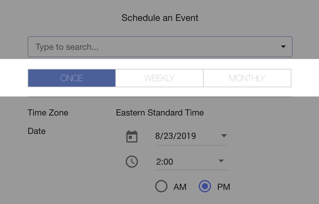
There was no naming or ending logic for each (recurring) event.
This means in the new event creation UI, I could provide fields or UI controls for users to name an event or configure ending logic of a recurring event.
It was not possible to view detailed information about an event.
An "Event Details" view is needed upon clicking on an event wherever available.
Design setup
As a designer myself, I usually like to start my interface design by listing the requirements and constraints for my project. These requirements and constraints can help me set the direction for my design.
Design requirements and constraints
Platform
Web
Responsiveness
MCP does not support compact mobile devices, but responsiveness is needed for desktop.
UI components
The new Event Scheduler will be using Material UI components as part of the larger MCP UI revamp initiative.
Accessibility
Keyboard browsing
Area of redesign
Given the release timeline and dependencies between UI, redesigning the entire environment container was not feasible. It would be more feasible to redesign within the expansion panel, where the existing Event Scheduler is located.


Interface layout
Within the expansion panel lives the Event Scheduler. This is the constraint I have to honor in the redesign. However, within the Event Scheduler, there is something I can change to enhance the experience.

I decided to position the event scheduling UI and events list to a panel which will be on the right of the calendar because this is a more common UI pattern for configuration / inspection options. Plus, configuration panel being the right sidebar is also used in other MicroStrategy products (i.e. HyperIntelligence Card editor), so there is a nice consistency across products.
Design
All-new calendar
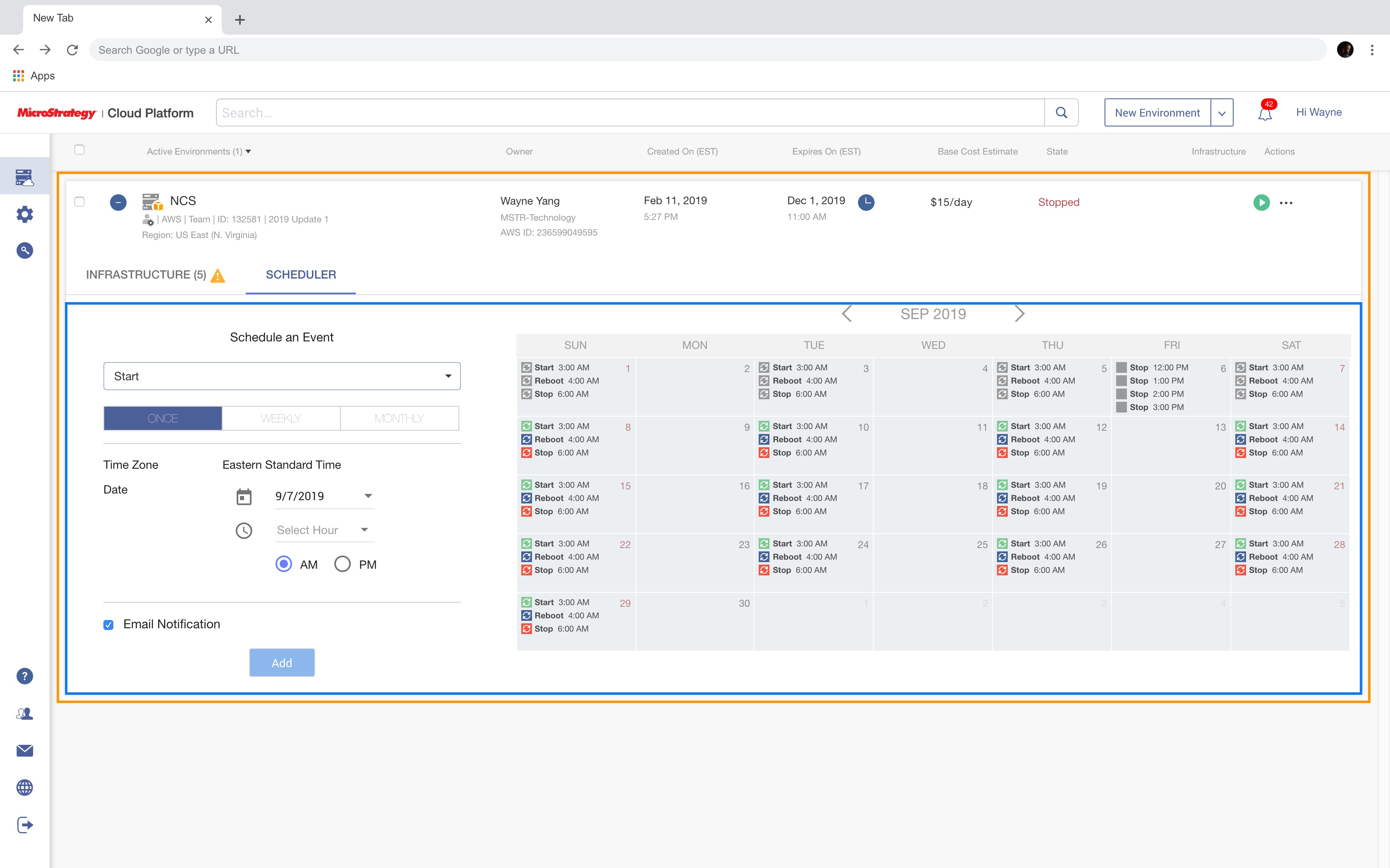
In the legacy calendar, no more than 4 events can be scheduled on the same day, and at the time of its development, there was no accessibility support built for it since it was a custom-built component, the whole calendar also can't respond to keyboard navigation.
In the new Event calendar, first I tried to remove the limitation on the number of events on the same day by making each calendar cell capable of holding no more than four events and adding indication of remaining events to the calendar cell. Clicking on a calendar cell with more than four events should bring the user to the Upcoming Events Panel to view full details.
The whole calendar component should also support keyboard navigation as part of the accessibility requirements.
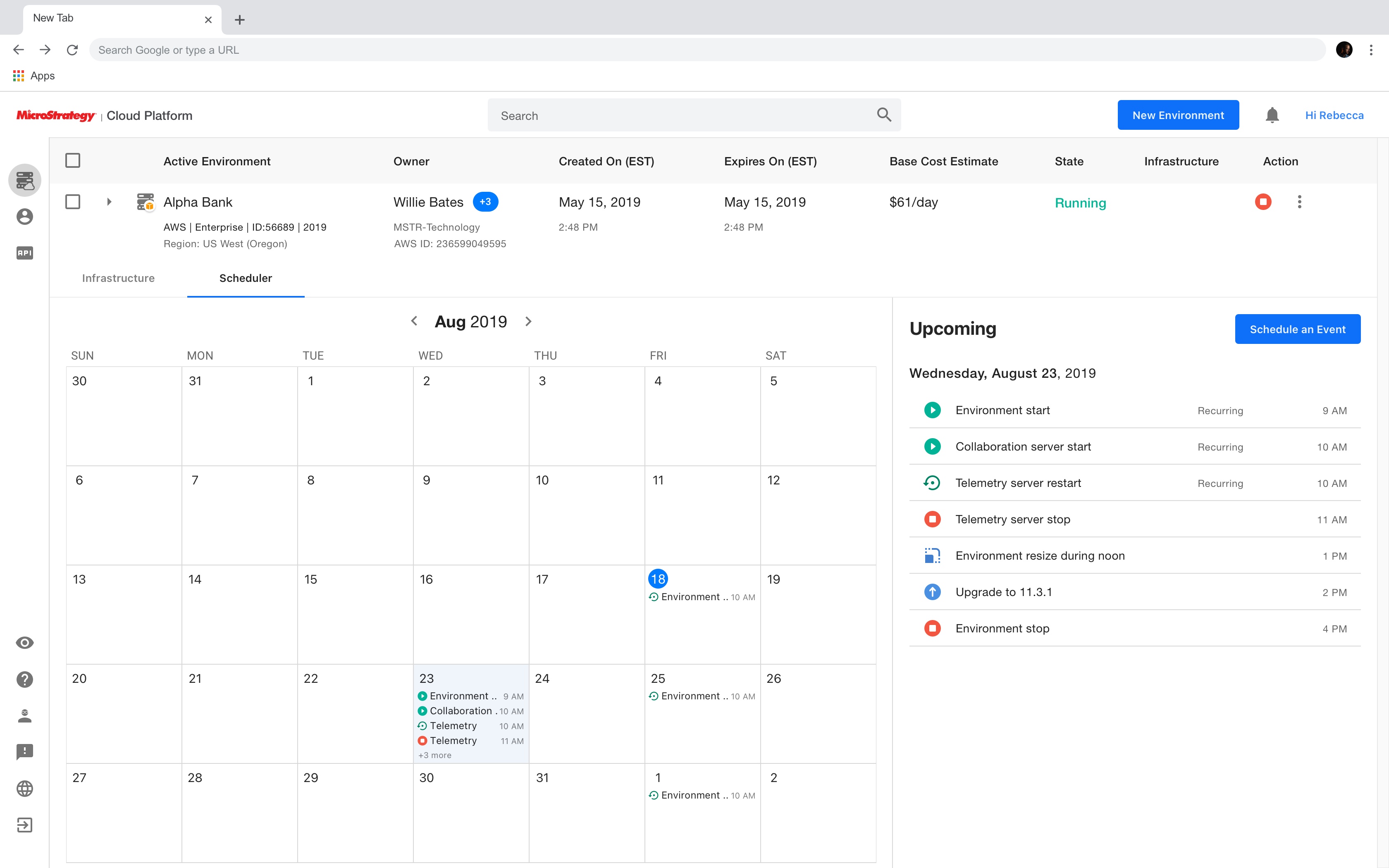
Upcoming events panel
In the legacy Event Scheduler, there was no centralized place for users to view and manage a group of events. Plus, with the introduction of the new calendar cell, user should be able to view all events on a single day in a separate panel.
Therefore, I wanted to introduce a new "Events" panel to the Event Scheduler. With the event scheduling UI being positioned on the right, it makes more sense to position the Events panel to the right of the calendar as well.
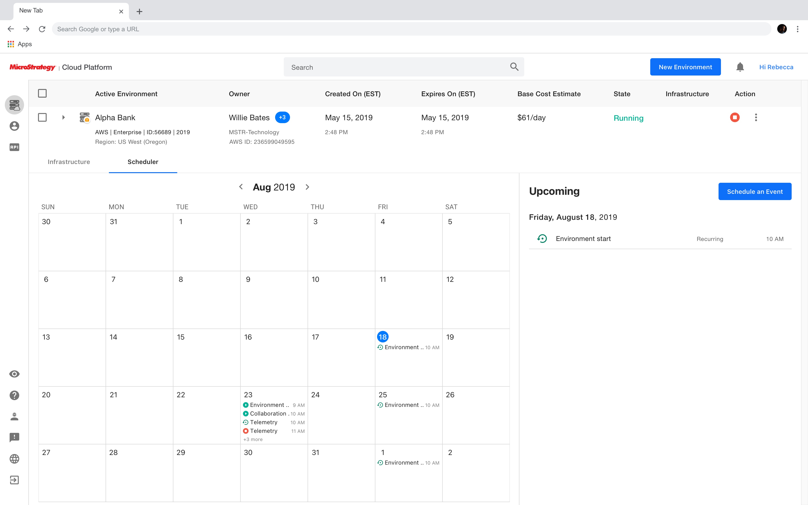
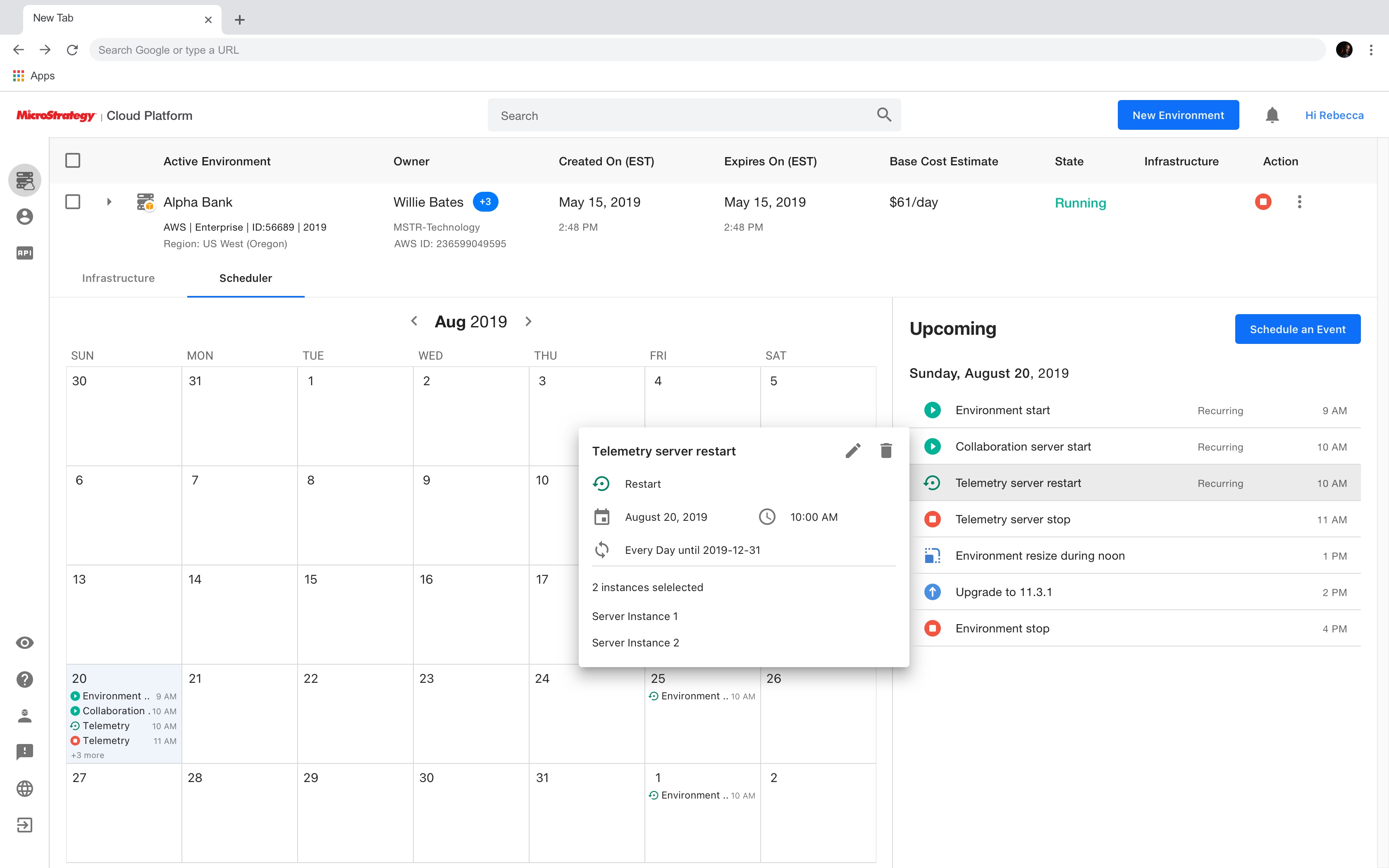
Information popover
As mentioned above, one of the most concerning usability issues of the legacy Event Scheduler was that user couldn't view detailed information about an existing event. Despite all the other information like frequency, starting and ending date of the event that were available during create mode, were not available to view it was created.
My solution is to provide more information about an event using a popover upon user's clicking on the event. A popover is a lightweight container for information and the most primary actions and it is less disruptive than a dialog. Therefore, I think it can be a great fit for providing additional information and quick access to important actions like editing and deleting the event.
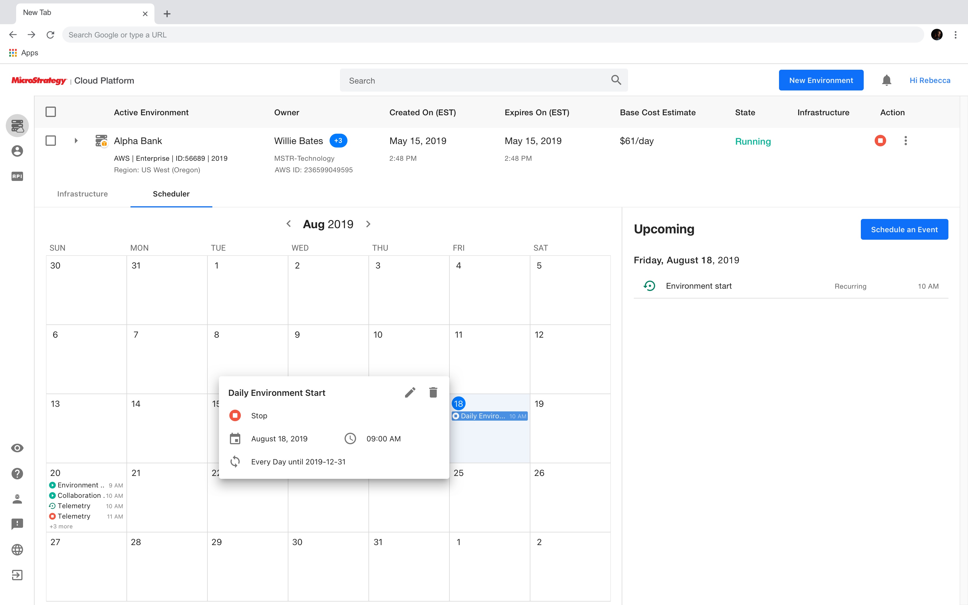
The information popover can also be triggered by clicking on an event in the Events panel.
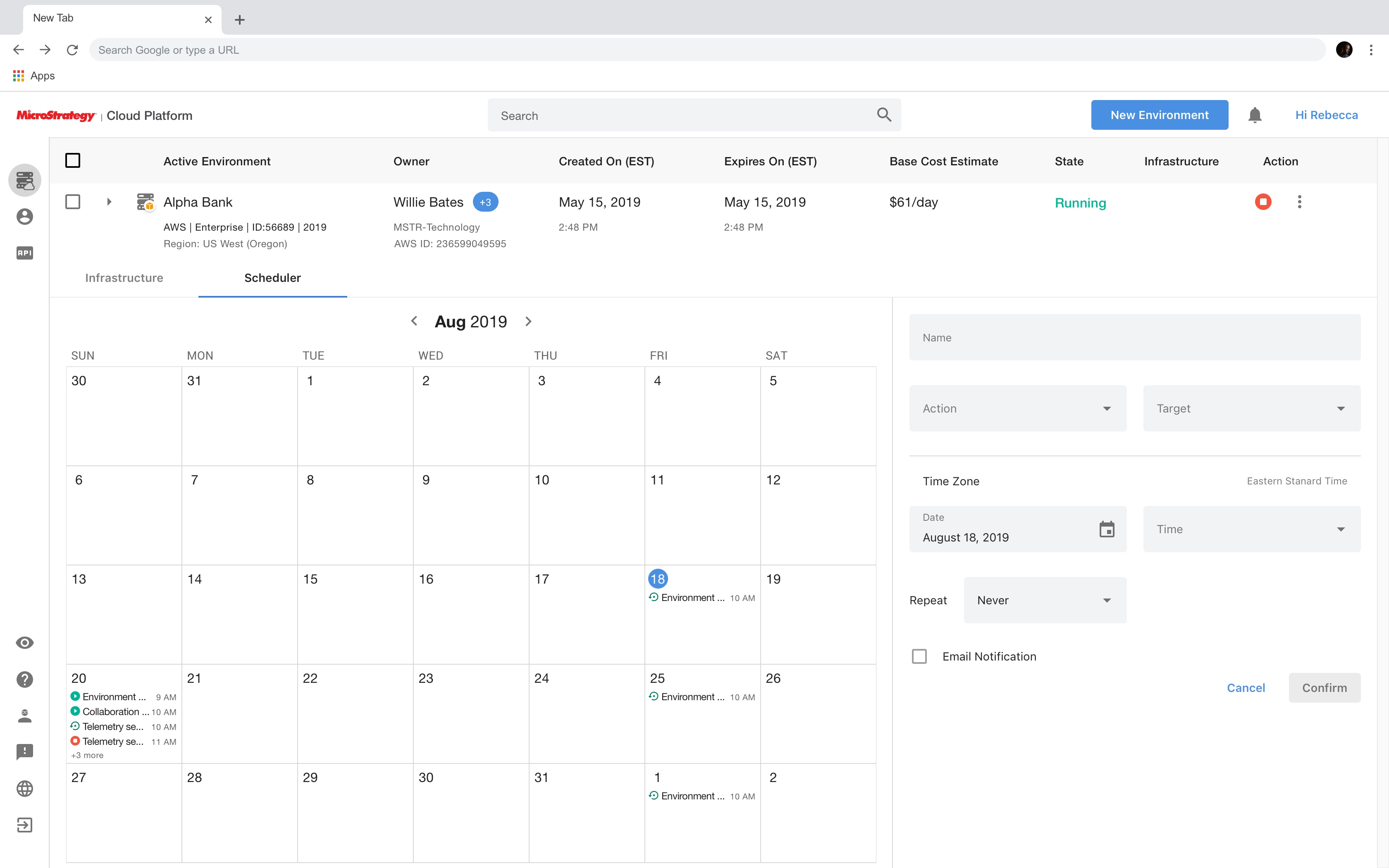
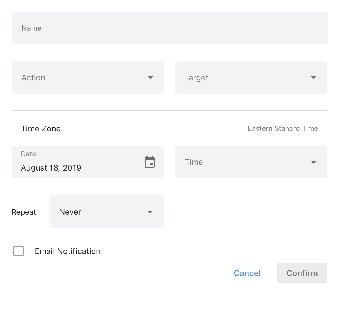
Redesigned event scheduling UI
At the end of the day, it is the event scheduling UI that cloud administrators will be using the most to set up or edit events. The core of the event scheduling UI of the Event Scheduler is the set of editable parameters (i.e. action type and frequency) behind the scene that construct the event. How to present these parameters to end-users in an intuitive and consistent way is the key to redesigning the event scheduling UI.
First, I tried to group them into two groups by looking at all the parameters that users could edit:
Textual parameter: a text/number field is best suited for this type of parameters.
Categorical parameter: Considering the number of values a parameter like action type and frequency could have is often greater than three and to keep the consistency among UI components, a dropdown menu is what I will use for this type of parameters.
Based on this, I created the redesigned event scheduling UI after several takes.
Usability testing
General feedback
After the engineering build became available, several rounds of internal and external testing were conducted for the new Event Scheduler. The general feedback was mostly positive. Testers found that the concept of scheduling administrative tasks as "Events" easy to understand as it sounds close to other calendar/reminder apps they are already familiar with. The experience of scheduling, viewing, and managing events is also intuitive and straightforward.
Areas of improvement
There are several areas of improvement found during the usability testing. Here are the highlights:


Cloud administrators aren't always located in the same region as their customers who use MCP environments. Therefore, this enhancement request does have its value of making it easier for cloud administrators to set up events that better fit their local customers' business schedules.
At the time of this usability testing, MCP team did not have enough engineering resources to implement custom time zone support without affecting the release timeline. This enhancement request was then scheduled to a later phase. However, I still think this enhancement is worth sharing.
Design handoff
After the usability testing and iteration on design, I set up meetings with the engineering team to go over approved user flows and the new UX/UI design. Then I created design specification for developers so that they can start implementing the design.
What I learned
When redesigning an existing product, it is crucial to take a look at the existing experience of the major flows, the user interface design, and accessibility features because oftentimes, due to lack of proper usability testing, engineering resources, or a tight release timeline, the legacy product might fail to deliver a great experience. By looking at the existing product, I was actually surprised by the number of usability issues I found and the fact that they had been neglected during the initial development.
Even when the product I was redesigning is an existing product that is being used by many users, proposing a rather different UI layout and new features (e.g. new Upcoming Events Panel) is also favored as long as they do fix current issues and enhance the experience, and there are enough engineering resources 😝😝.


